Cameron Art Museum Graphic Design Internship
May 2025 - August 2025
During my time as a Graphic Design Intern at the Cameron Art Museum, I worked closely with the marketing department to design print and digital materials for exhibitions and community events. Using Adobe Illustrator, InDesign, and Canva, I created visitor screens, print media, web graphics, and other promotional materials while maintaining consistency with the museum’s brand identity.
Most projects involved working with existing company assets and adapting them into new layouts or refreshed color schemes for each event. What I really enjoyed about working at CAM was gaining experience designing for different events that reached both broad and specific audiences. I loved the variety it taught me and seeing how different designs could translate across various media. Additional design work from this internship is available upon request.
Print Media & Signage
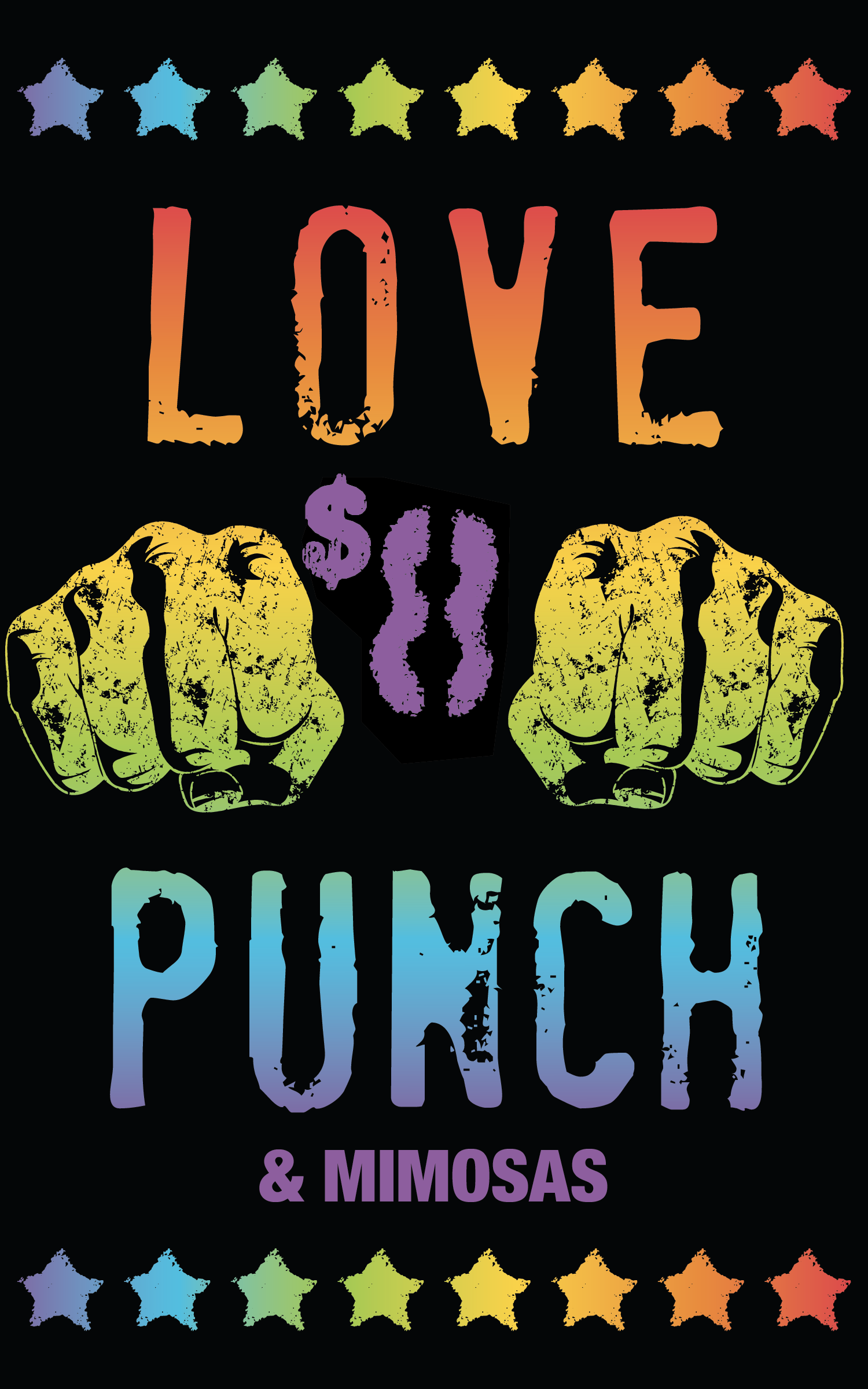
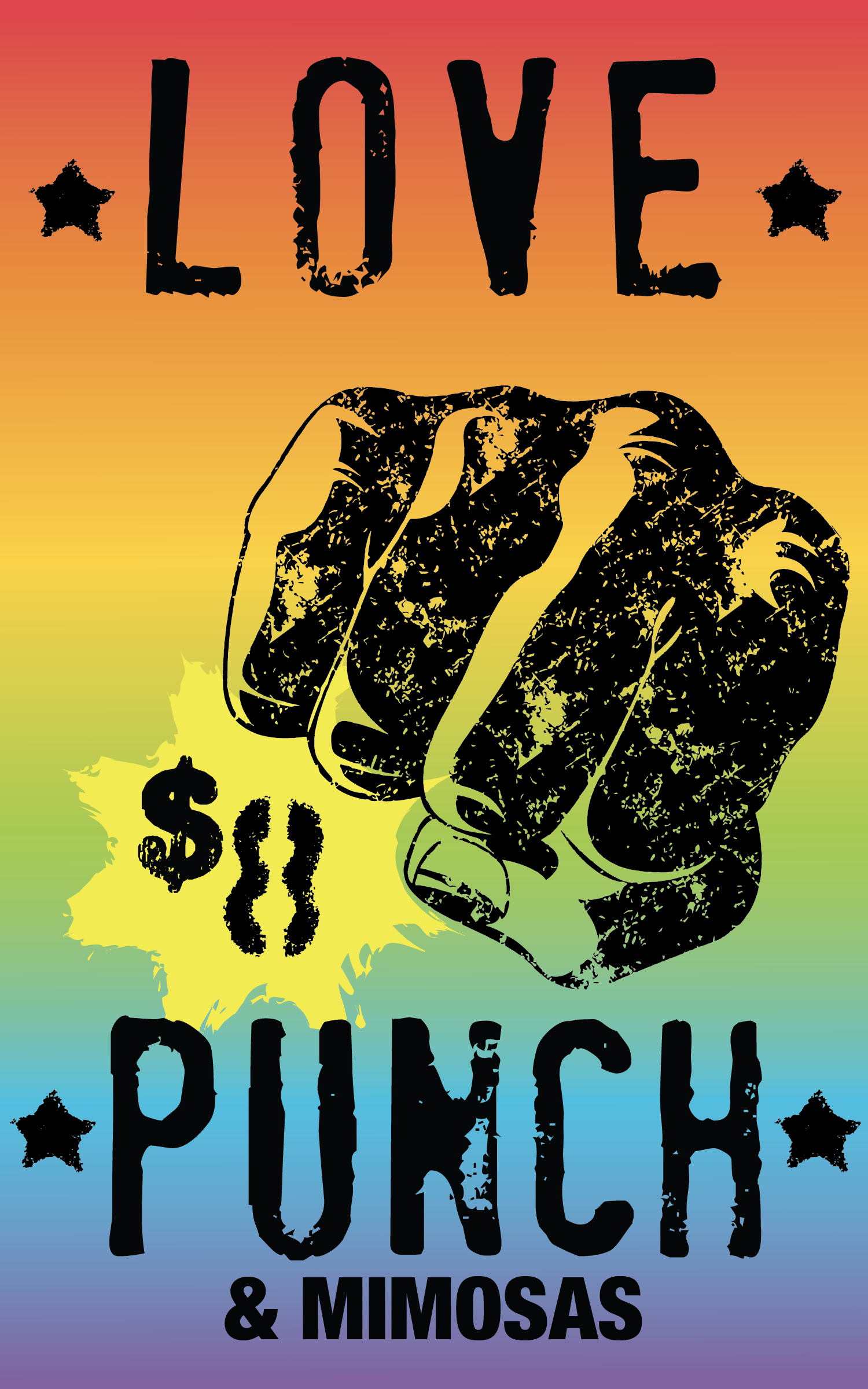
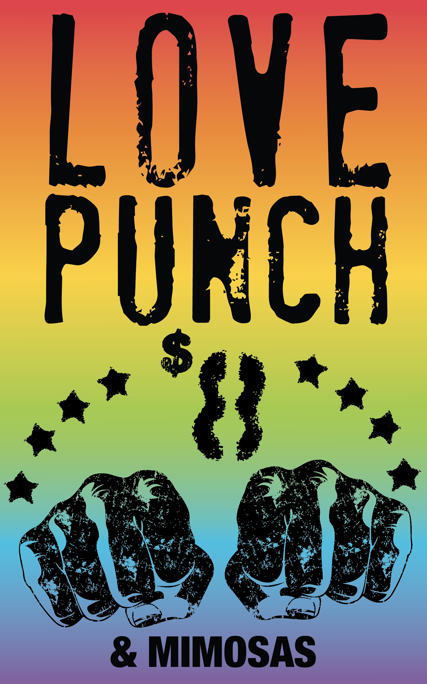
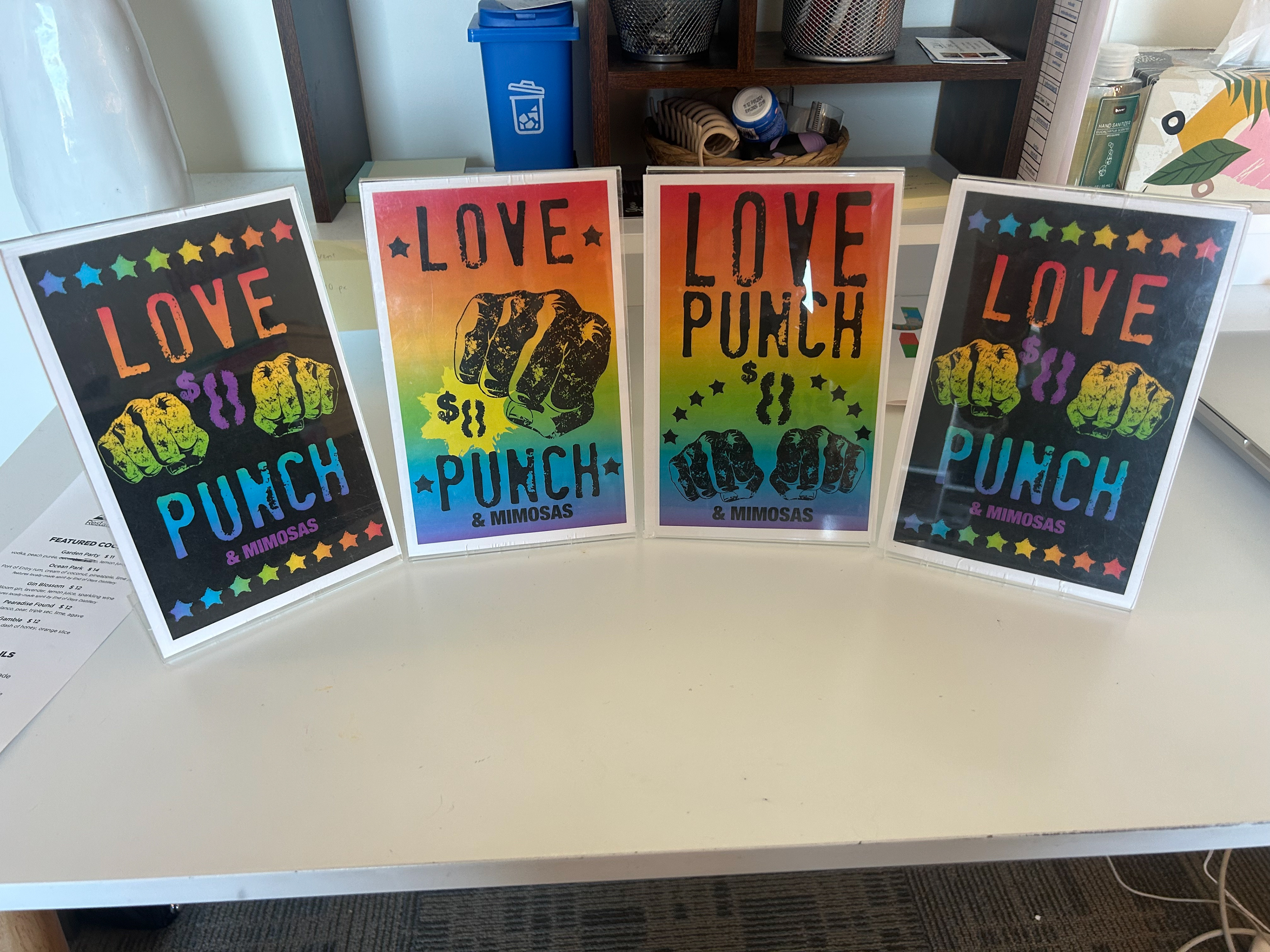
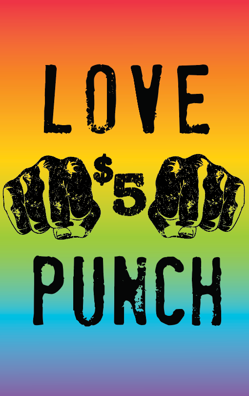
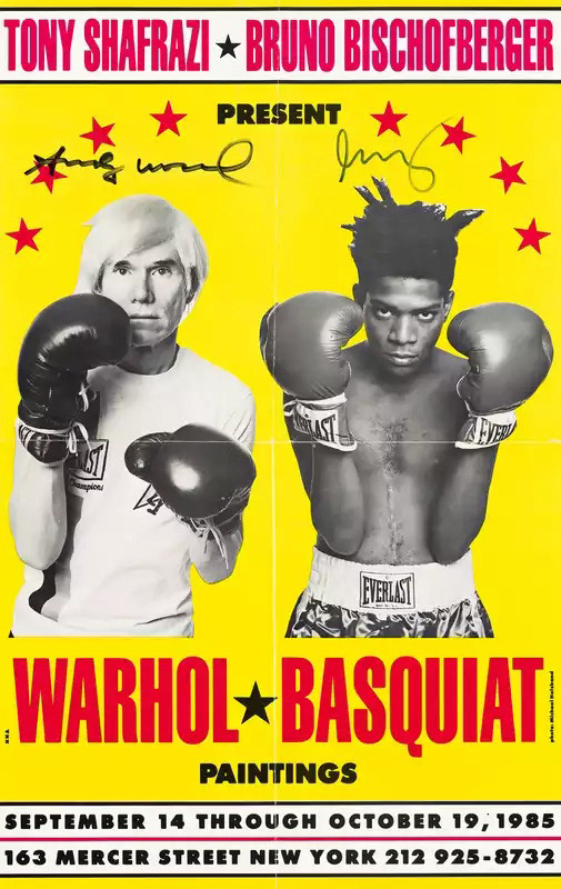
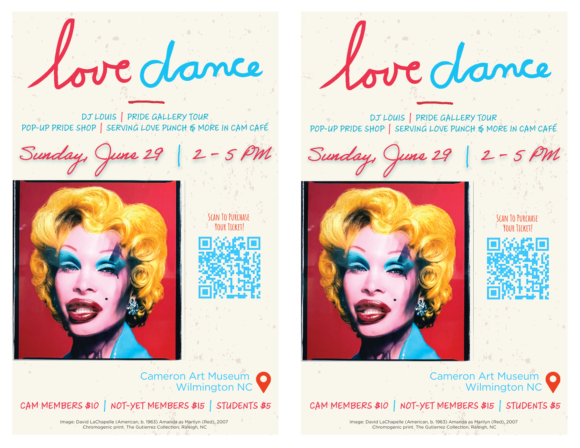
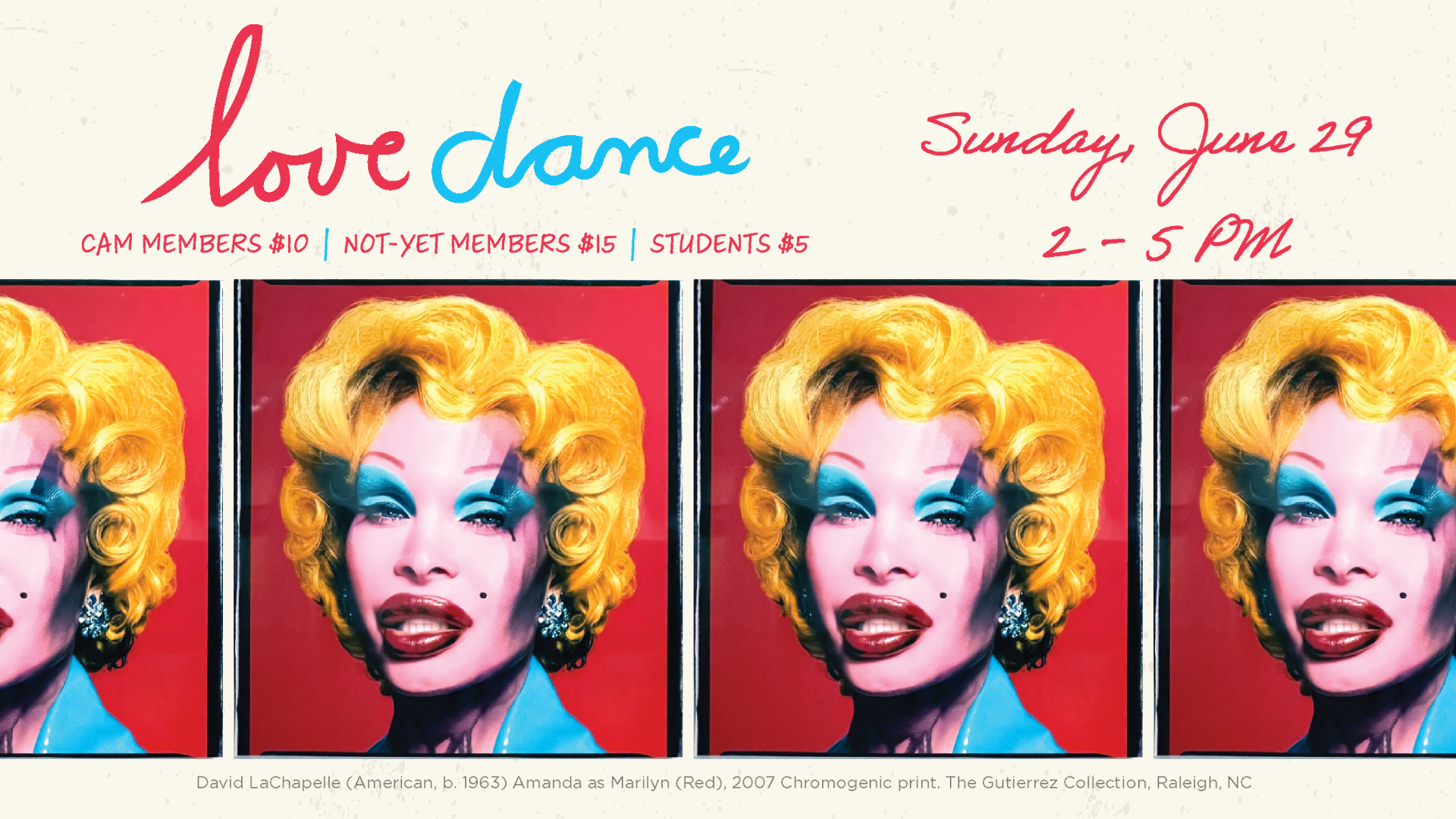
LOVE PUNCH SIGN DESIGN UPDATE
For the 2025 Love Dance event, I was tasked with revamping the “Love Punch” signs. Using Adobe Illustrator, I kept the same font and fist vector from the previous year’s design to maintain its original inspiration from Basquiat and Warhol’s boxing imagery. Because the event celebrates Pride, I chose to keep the rainbow color scheme while playing with movement, layering, and bold pop-art elements like stars and comic “pow” shapes. I created three different versions of the sign, all of which were printed and displayed at the event. Once finalized, I imported the Illustrator files into InDesign to properly format them for printing.
OLD DESIGN & INSPIRATION:
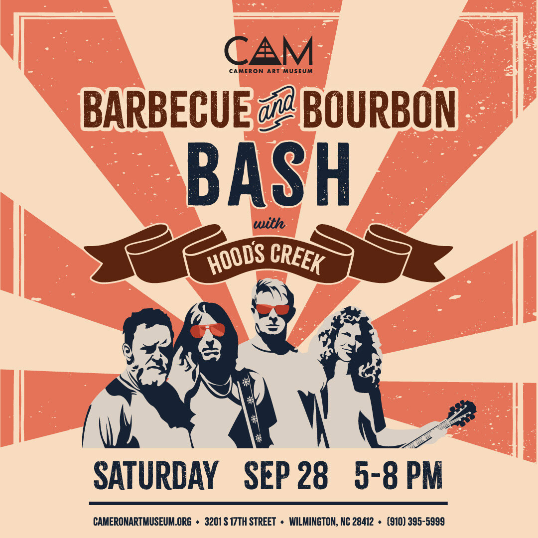
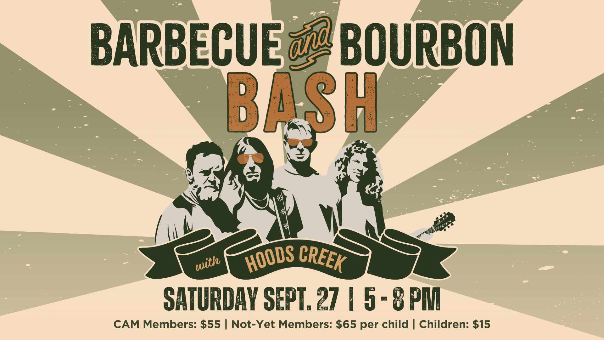
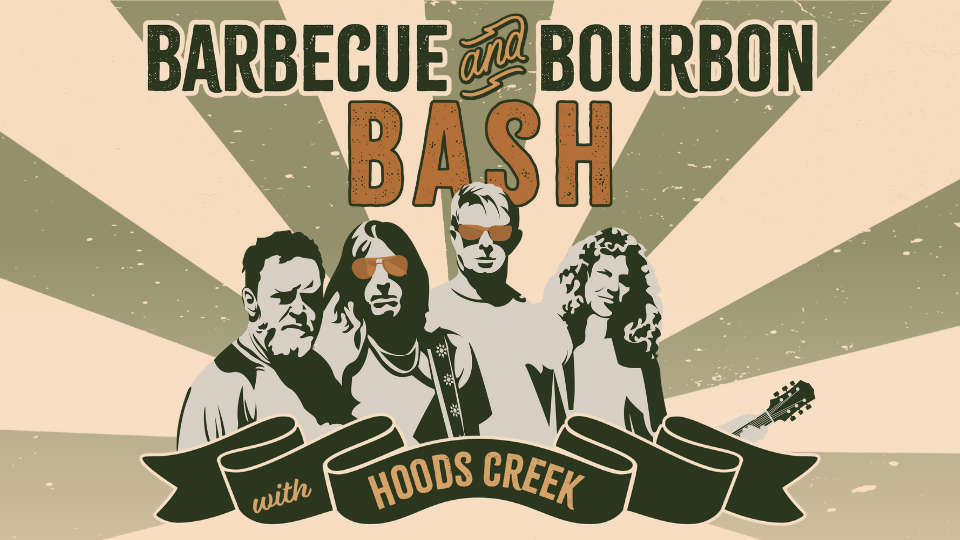
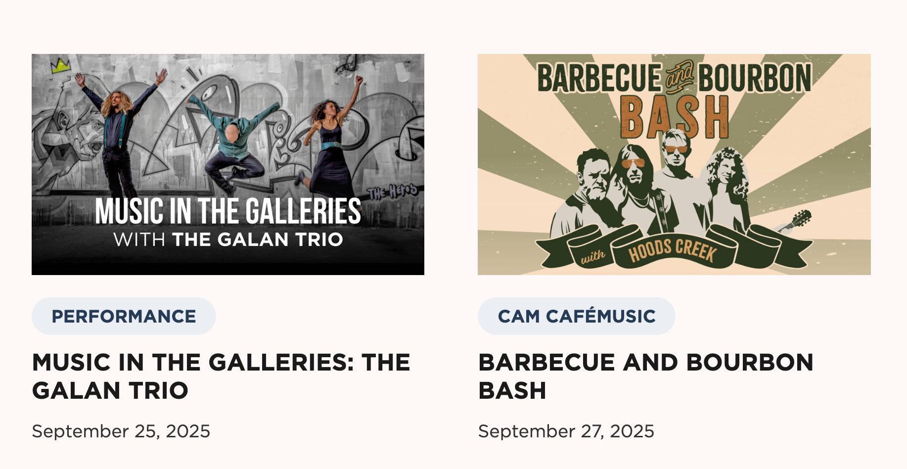
BARBECUE & BOURBON BASH NEW COLOR SCHEME
For this event, I was tasked with revamping the color scheme of the original designs and adapting it across all visual materials, including visitor screens and digital graphics. At the band Hoods Creek's request, green was to serve as the dominant color. To maintain the event’s vintage and autumnal aesthetic, I developed a palette of olive, gold, pale yellow, and orange.
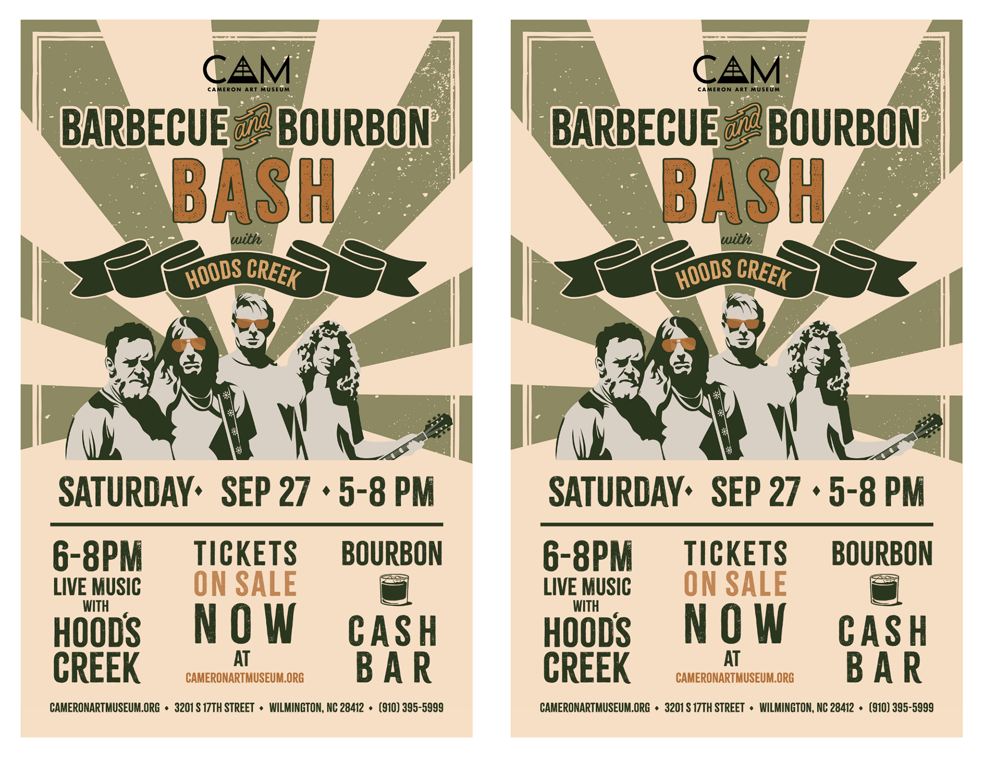
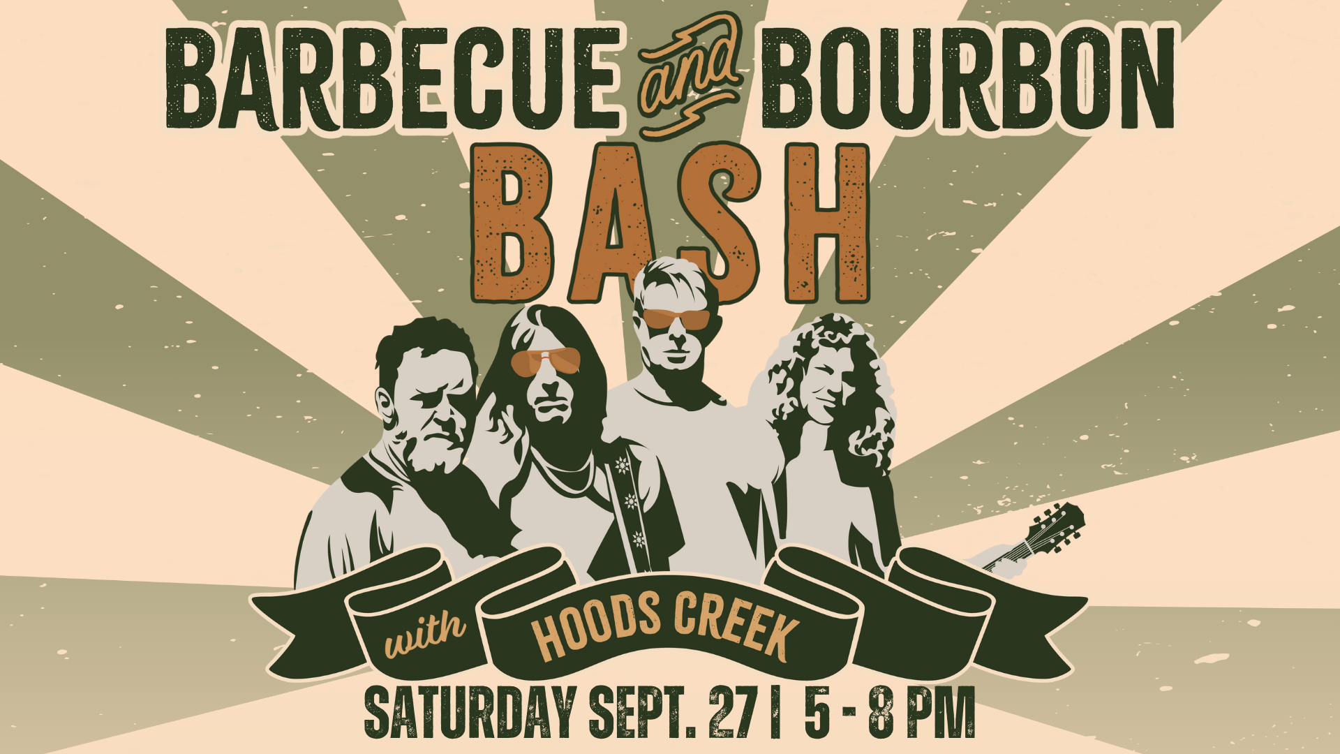
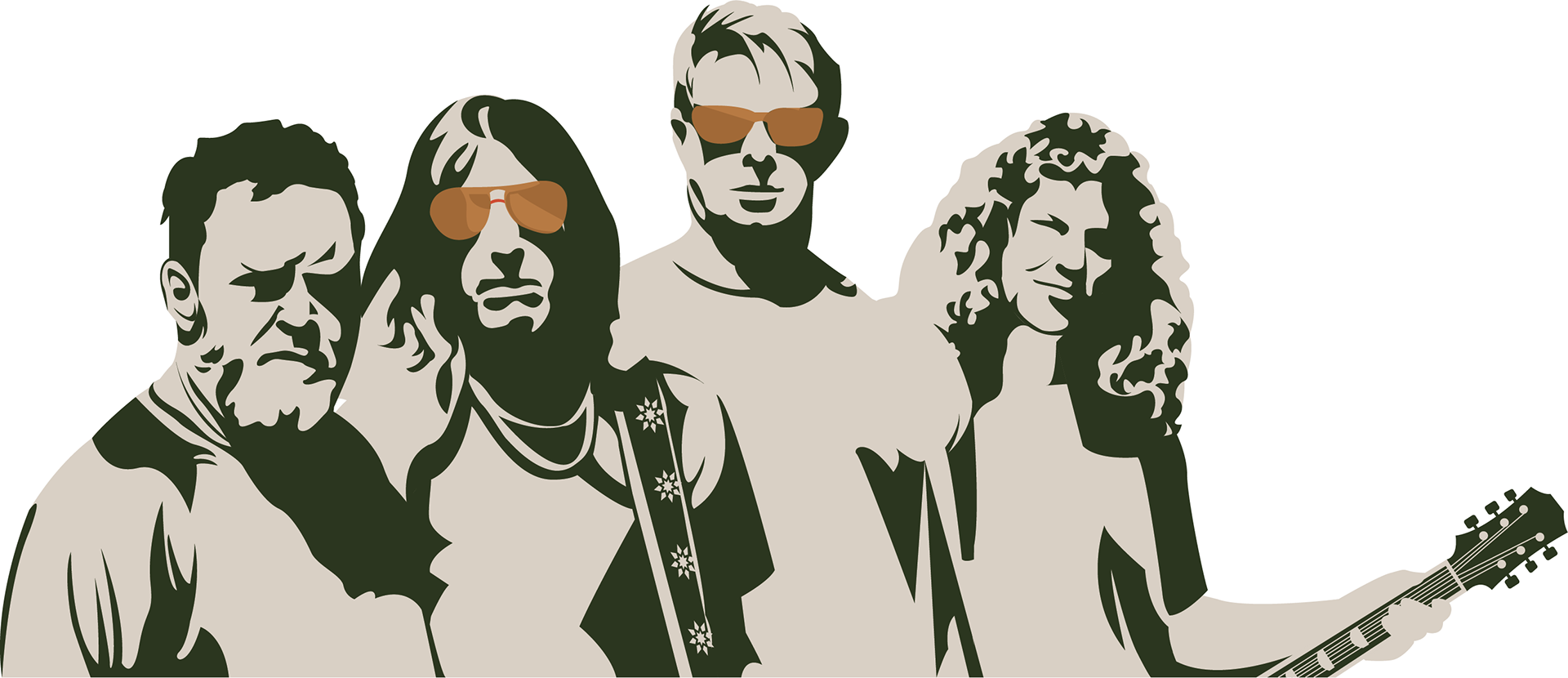
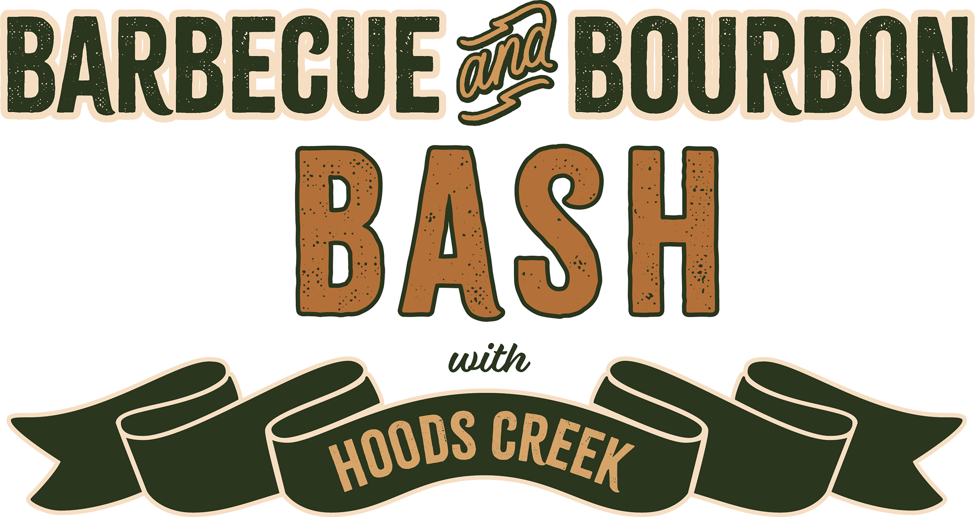
OLD DESIGN & COLOR SCHEME V.S. NEW PALETTE:

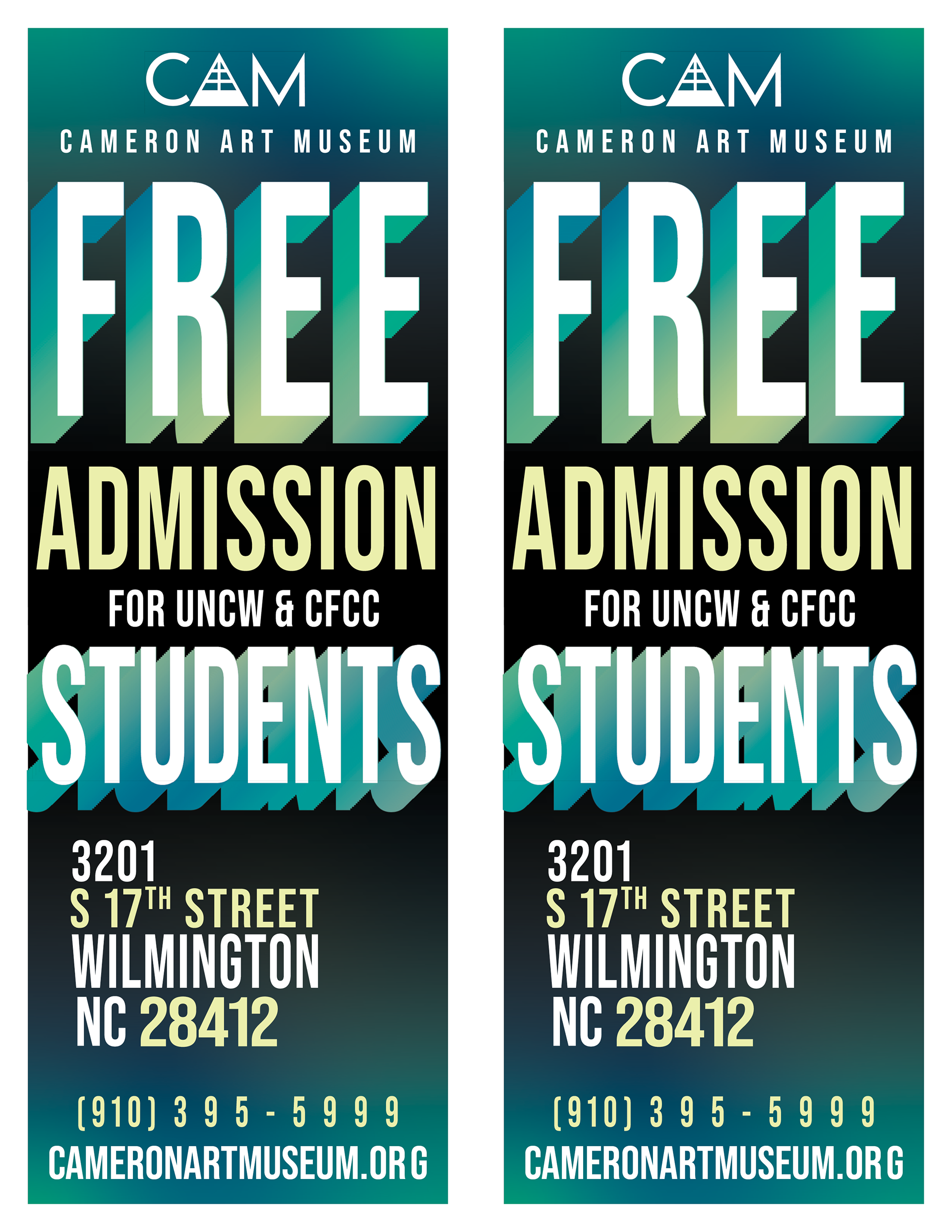
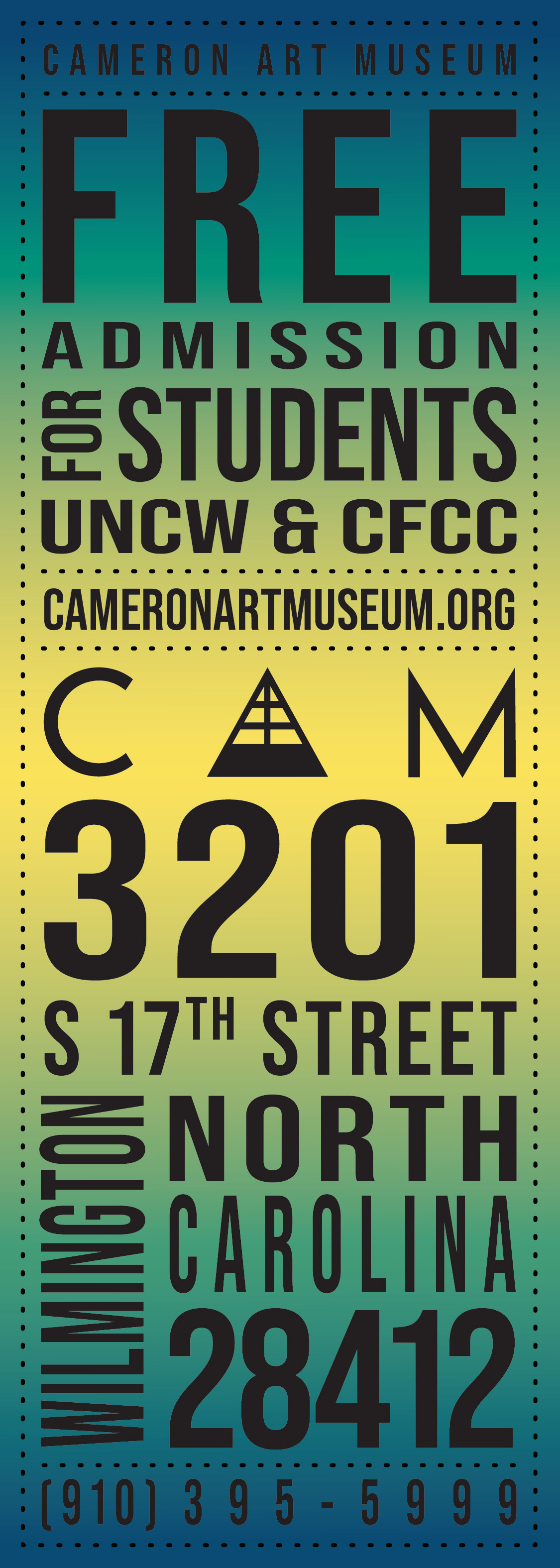
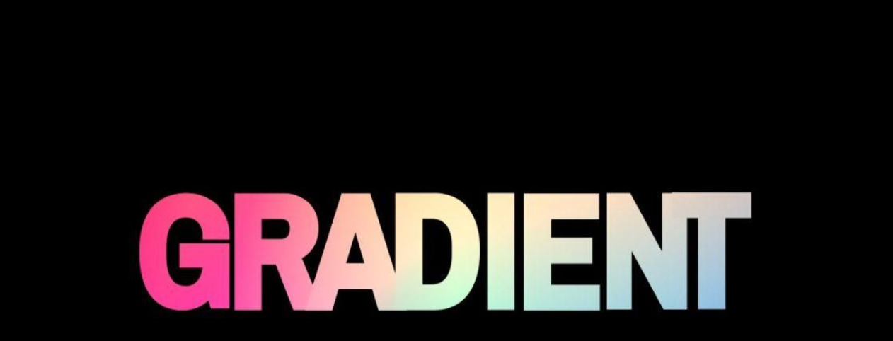
STUDENT FLYER RE-DESIGN
For this project, I was tasked with creating a new student flyer and had full creative range. I designed the layout in Adobe Illustrator, keeping CAM’s brand identity in mind by using the font Bebas Neue Pro, which is often paired with Gotham in their materials. The previous flyer featured a teal and blue gradient reminiscent of UNCW and CFCC, so I created a new freeform gradient to continue appealing to that audience. I wanted to keep the original’s dynamic typography but refresh it with a more playful, modern feel. I was also instructed to make sure “FREE” and “STUDENTS” stood out, so I added a drop-shadow text effect through distort and masked it with the same gradient for consistency. Once the design was finalized, I imported it into InDesign to format it for print.
OLD FLYER & INSPIRATION:
CAM MADE HOLIDAY MARKET POSTER UPDATE
For this project, I was instructed to revamp the poster for the annual CAM-Made Holiday Market. The poster was to keep the same logo but needed a new color scheme that avoided a traditional Christmas look. I used Adobe Illustrator and Canva to create the updated design. Since the goal was to give it a more market feel, I chose a cottagecore-inspired color palette that reflected the handmade nature of the vendors’ work. To still capture a touch of the holiday season without making it feel overly festive, I added a wreath border for subtle seasonal detail.
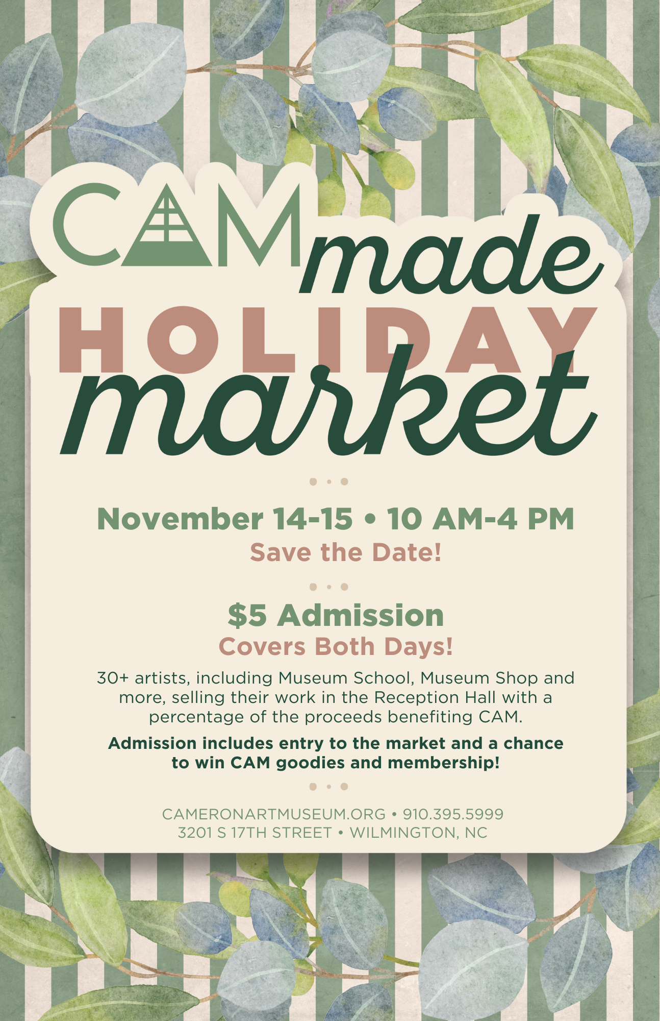
OLD POSTER:
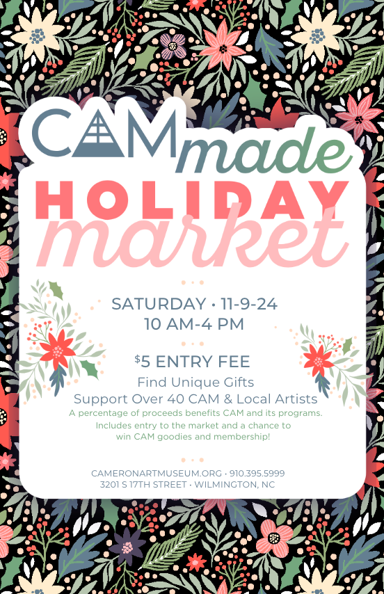
TABLE TOP & POSTER DESIGNS
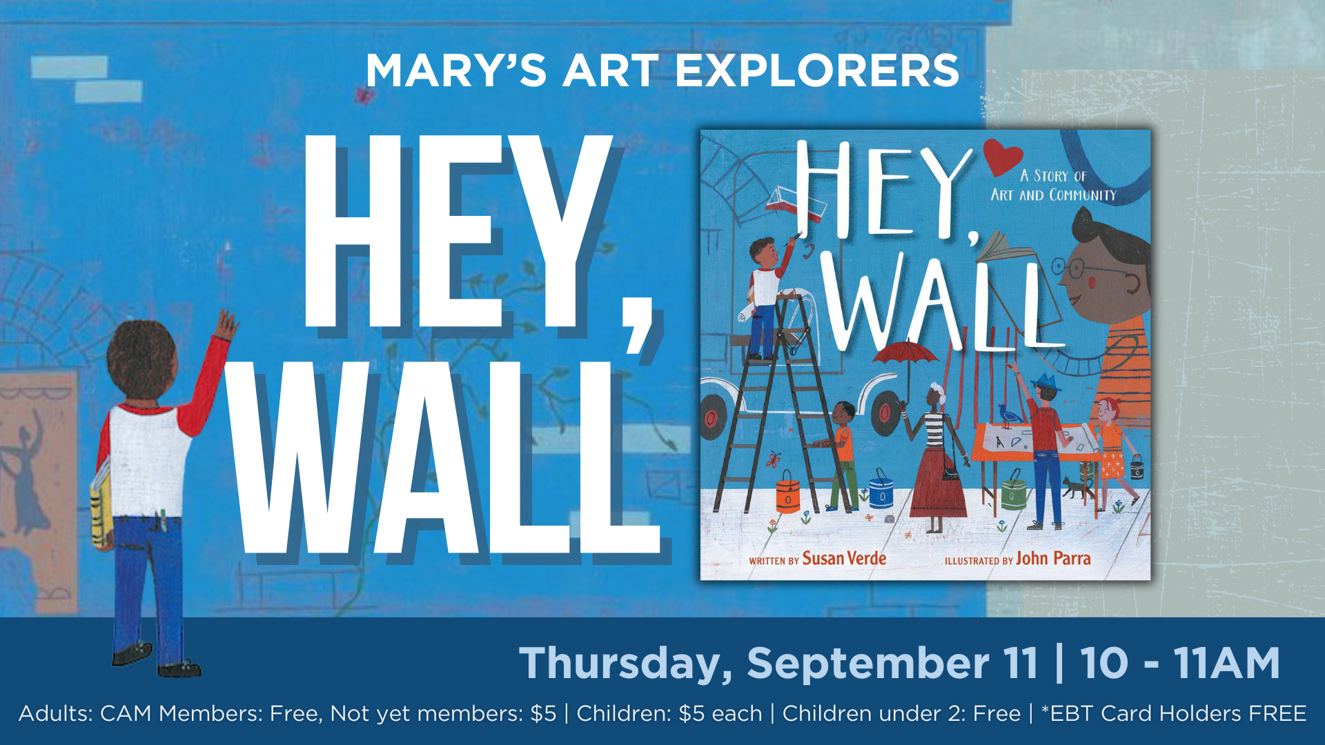
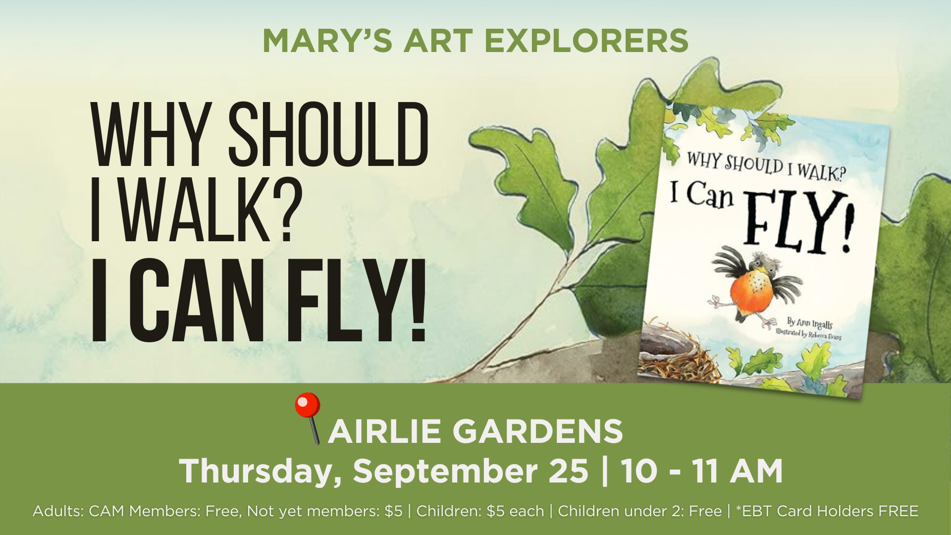
For the final set of print media, I frequently designed tabletop displays for the CAM Café and additional posters and flyers for the rest of the museum’s exhibits and events. Most of these were created in Canva using existing company assets and adapted from original CAM designs. As an intern, I had less creative control over these pieces, but the experience taught me a lot about adapting different designs across various forms of media.
Love Dance Table Top
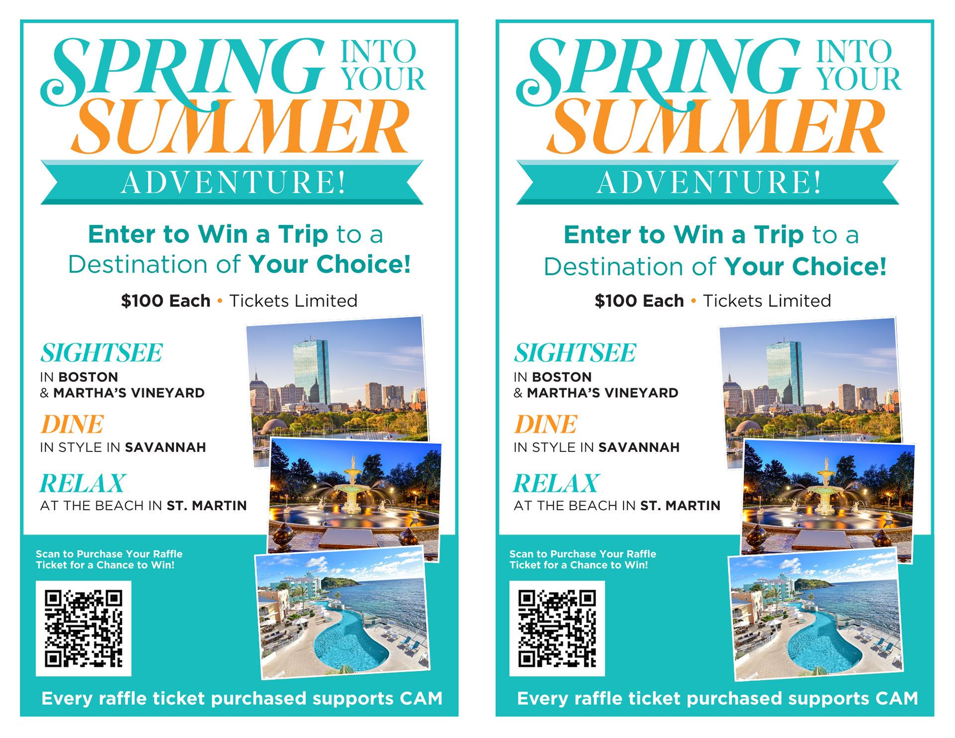
Summer Raffle Table Top
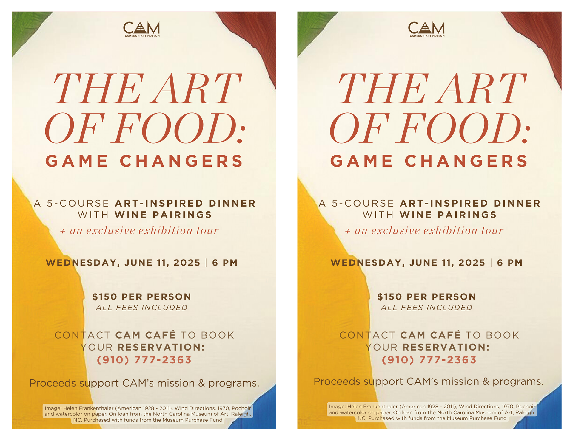
The Art of Food Table Top
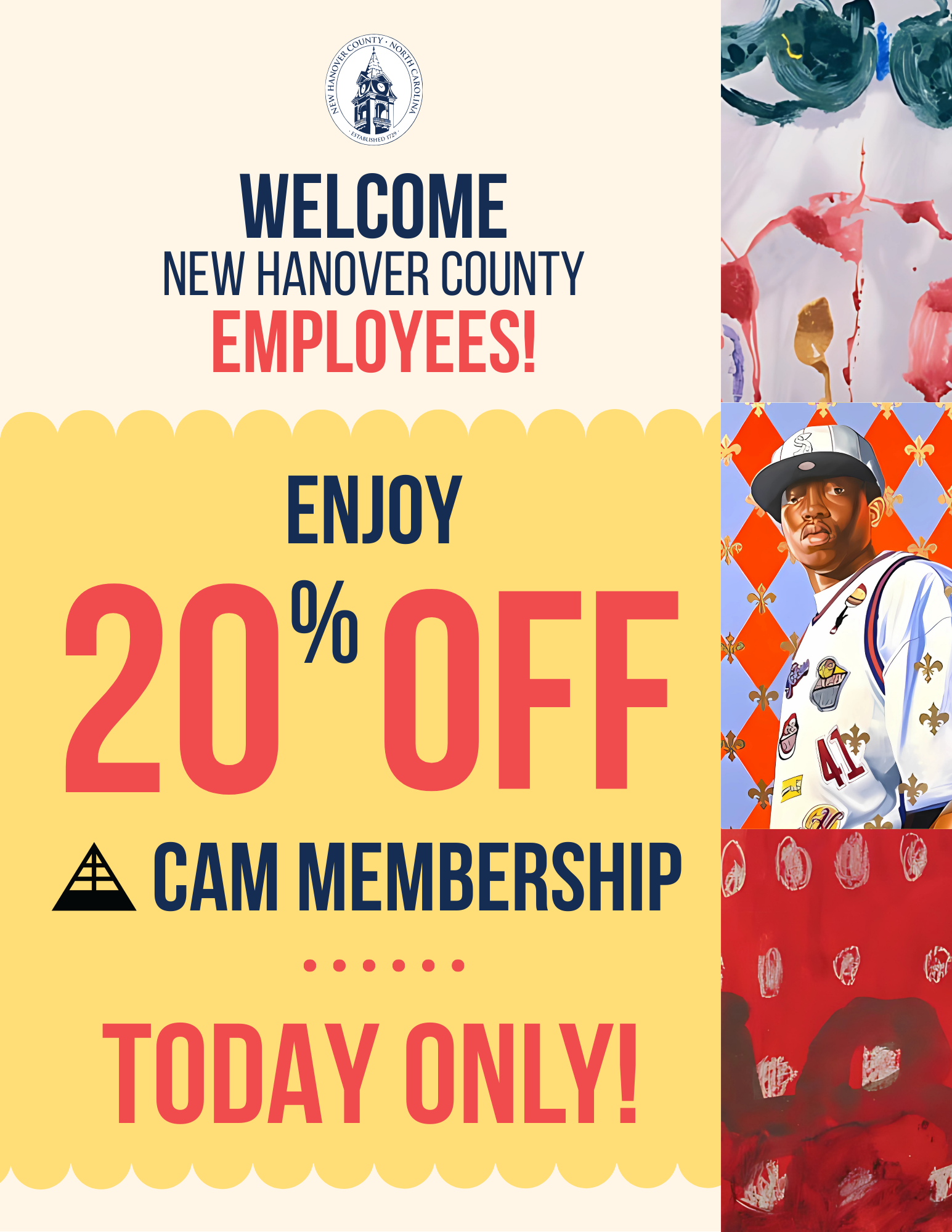
NHC Employee Day Poster
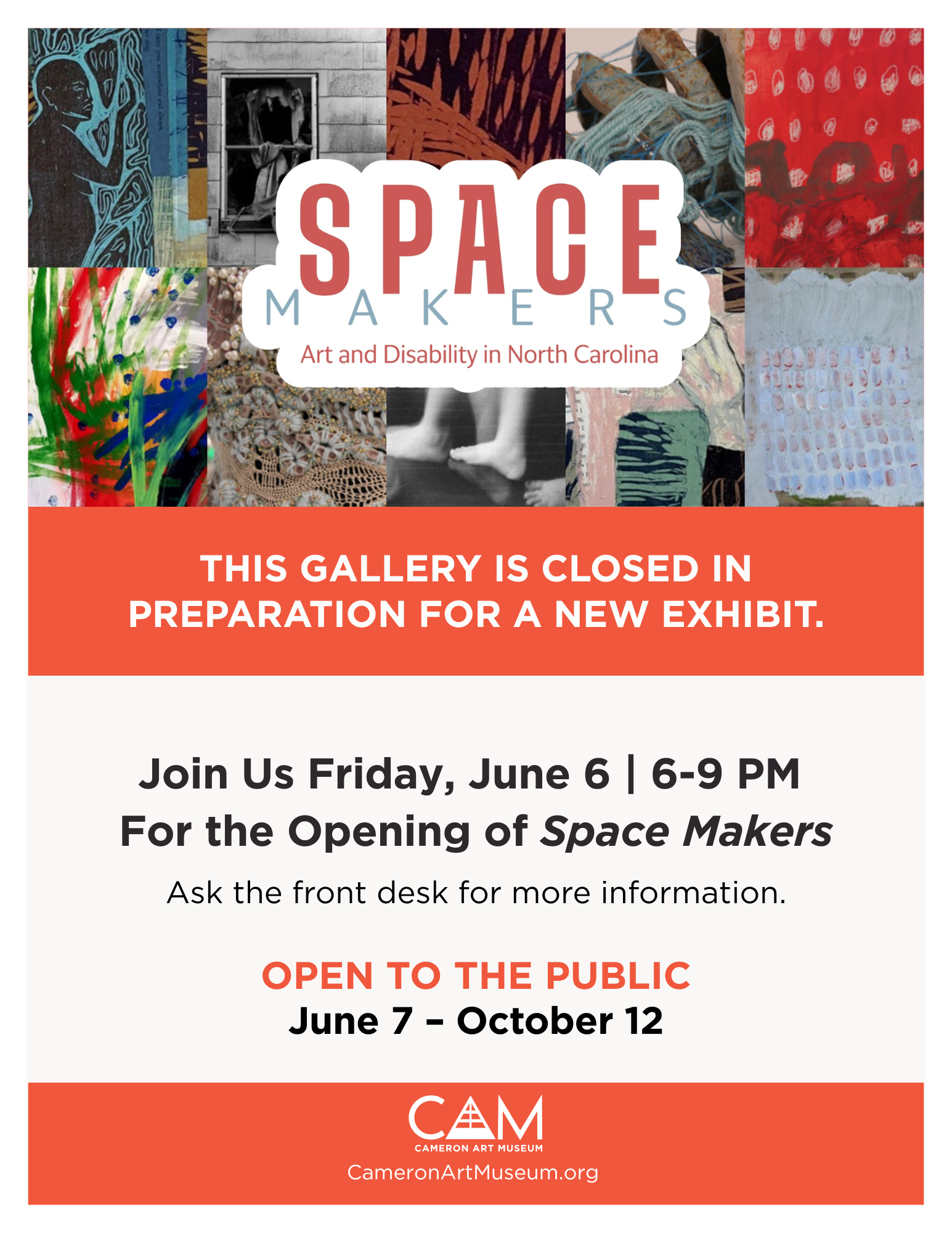
Closed Exhibit Sign
Digital Media
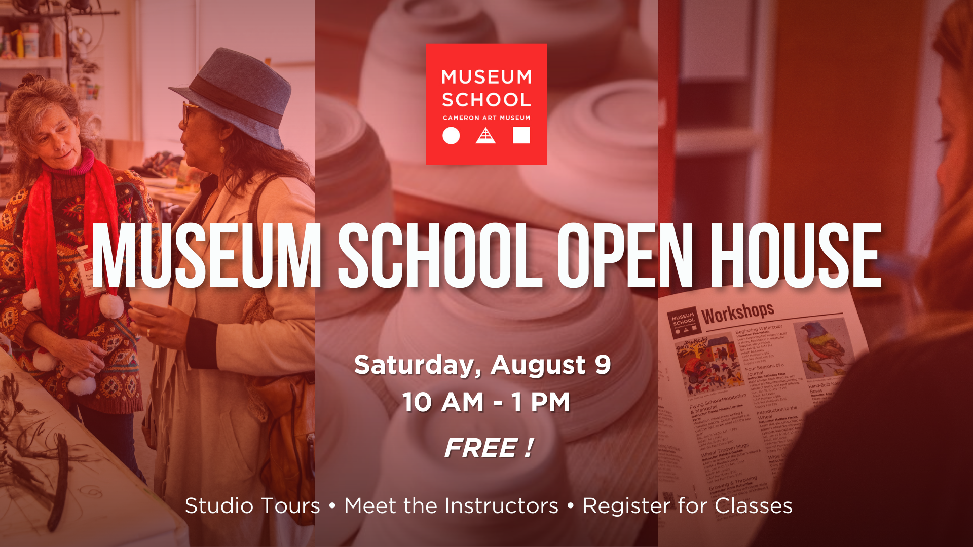
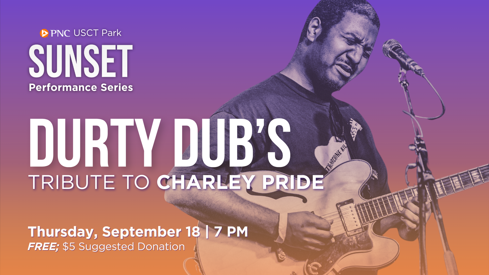
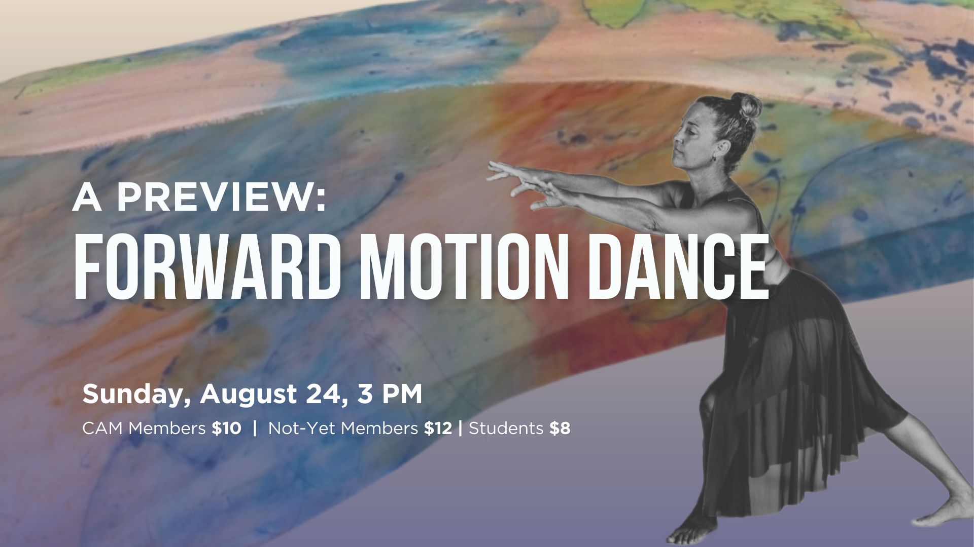
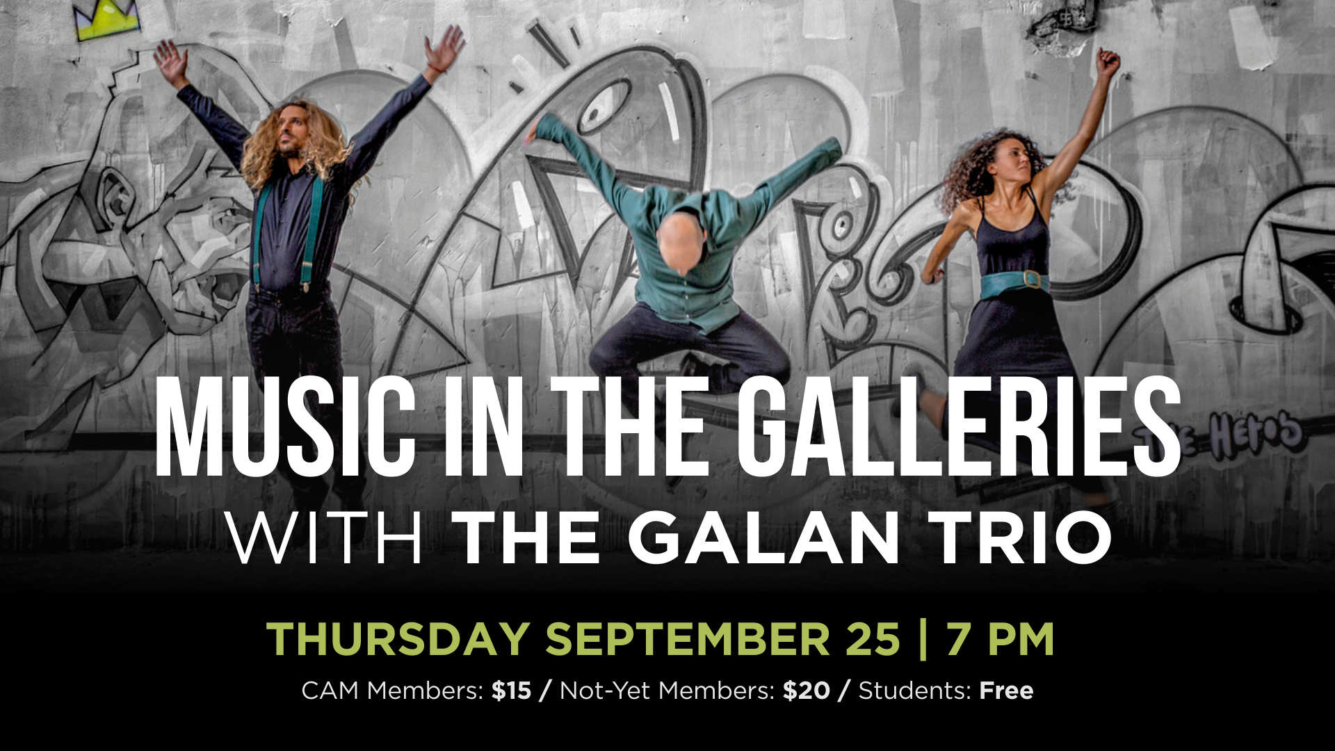
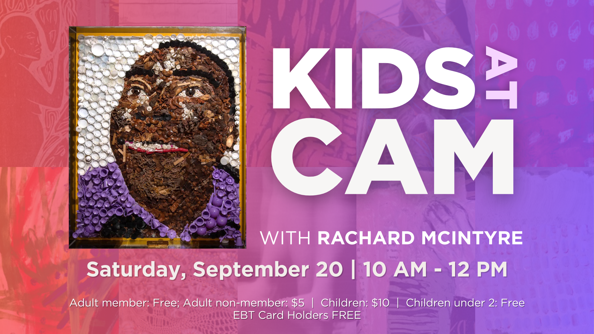
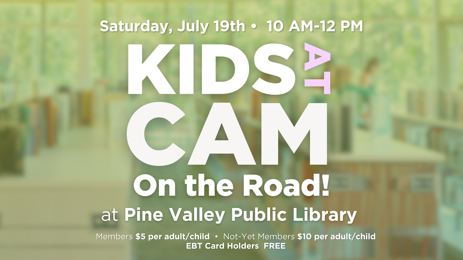
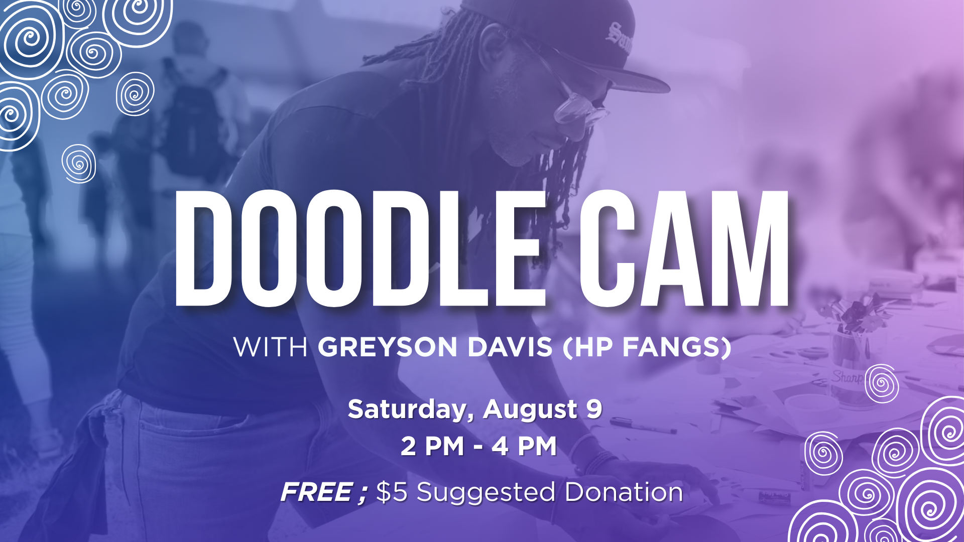
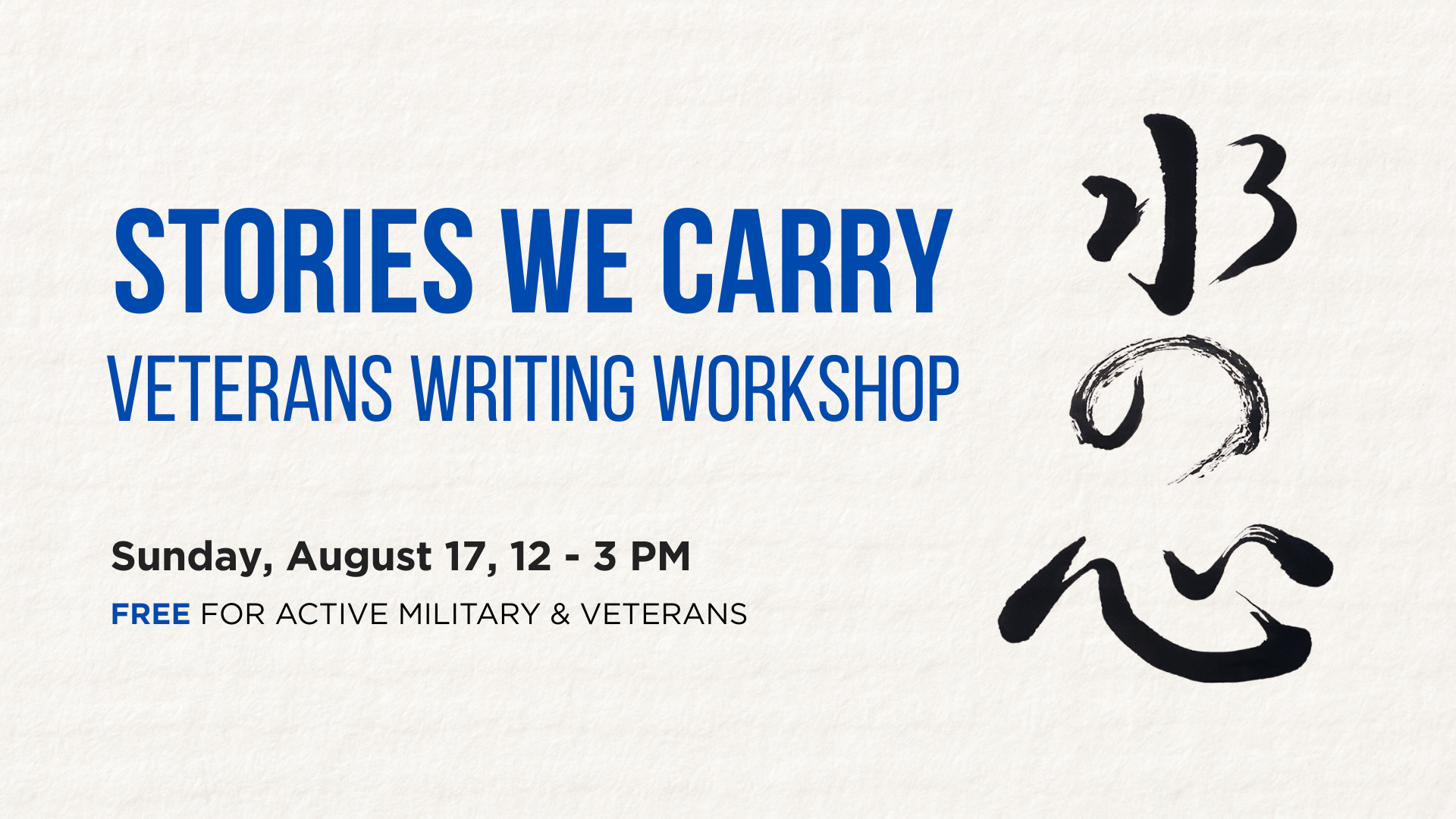
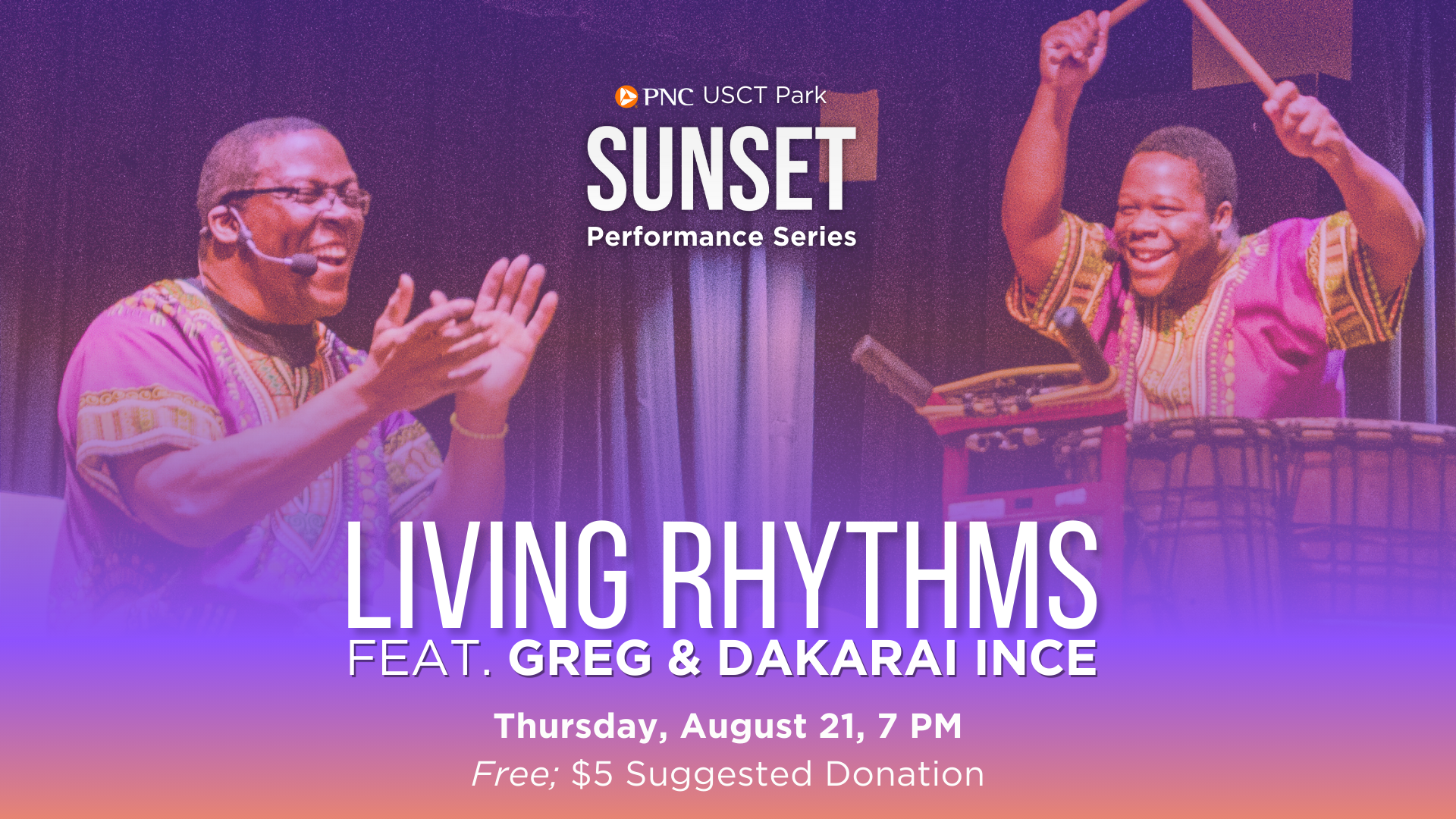
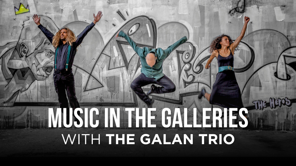
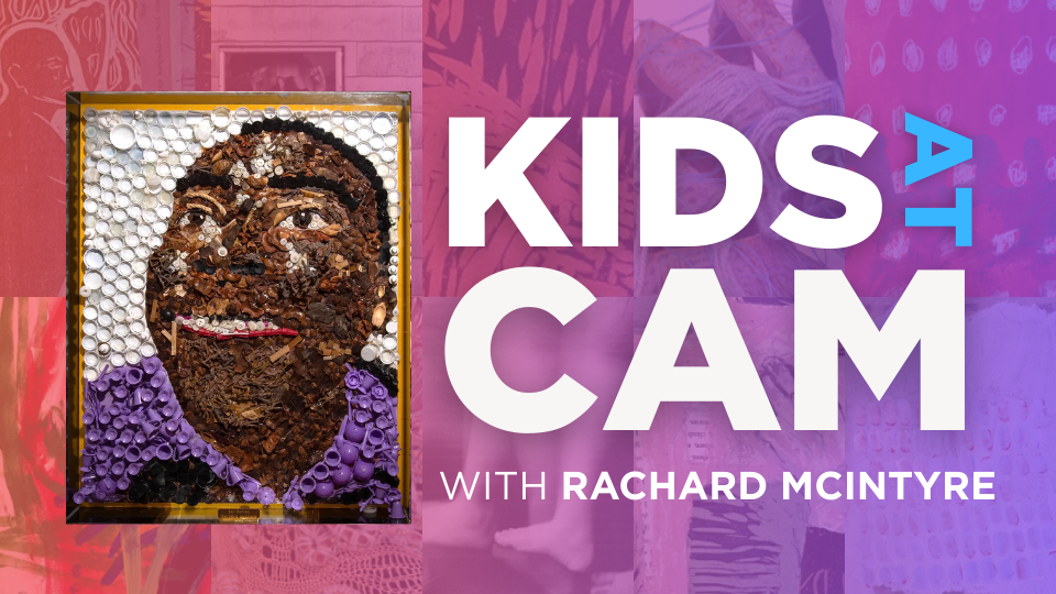
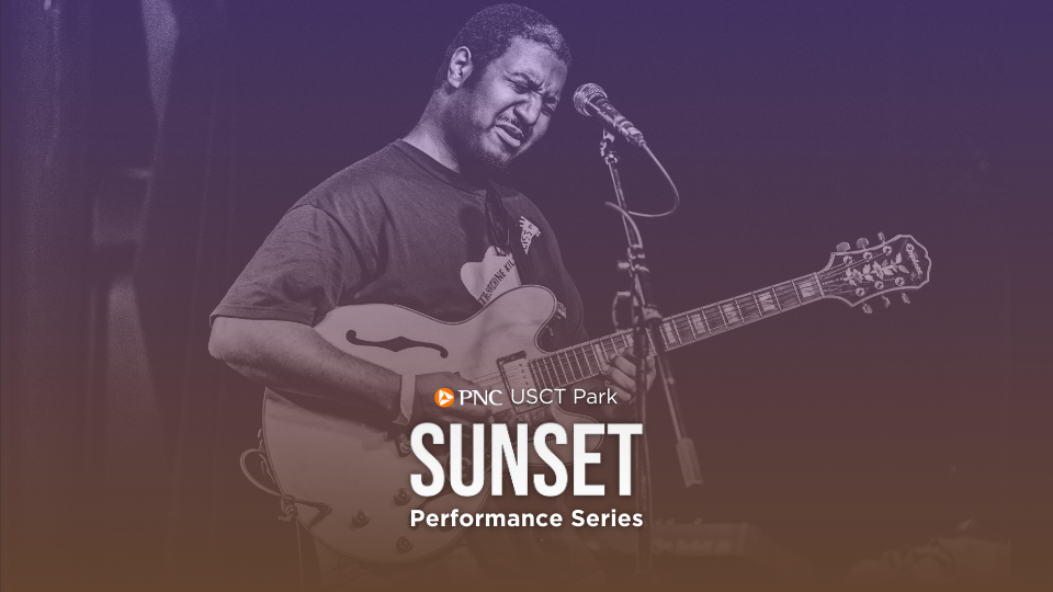
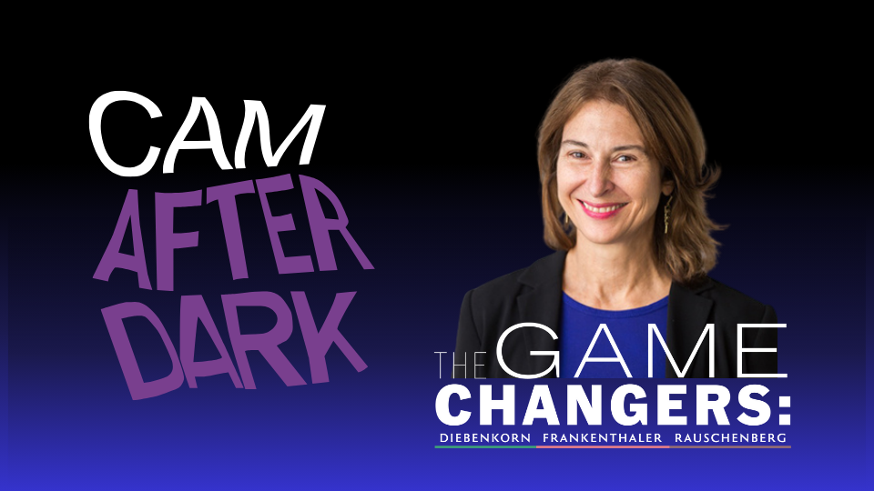
WEEKLY VISITOR SCREENS
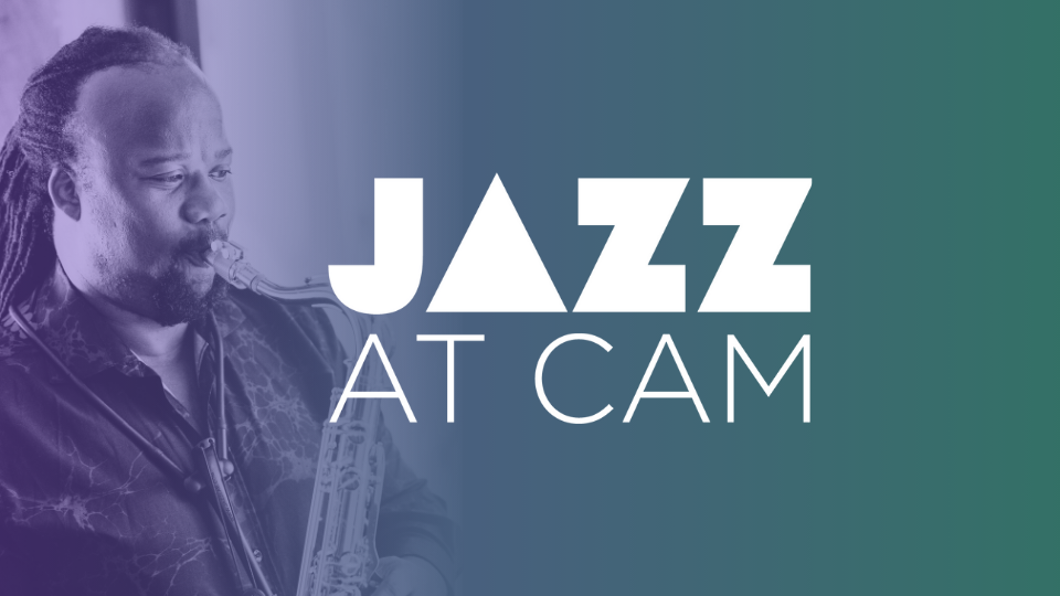
Each week, I created designs for the museum’s visitor screens located at the front desk. These highlighted a variety of upcoming events, including music performances, Kids @ CAM programs, art classes, and community activities. All designs were created in Canva using the company's existing assets. This project helped me improve my understanding of visual hierarchy and typography, and taught me how to adapt designs for different audiences while keeping a consistent brand look.
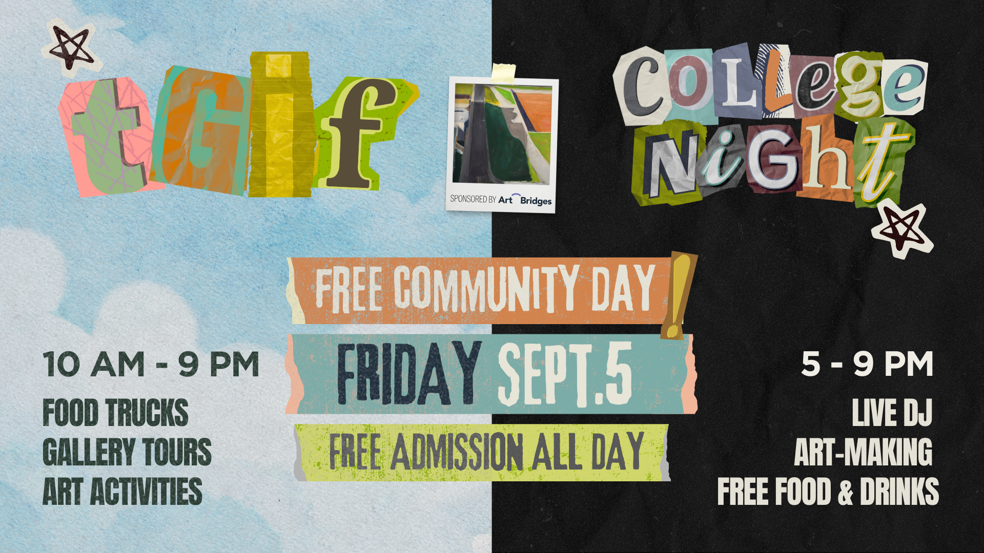

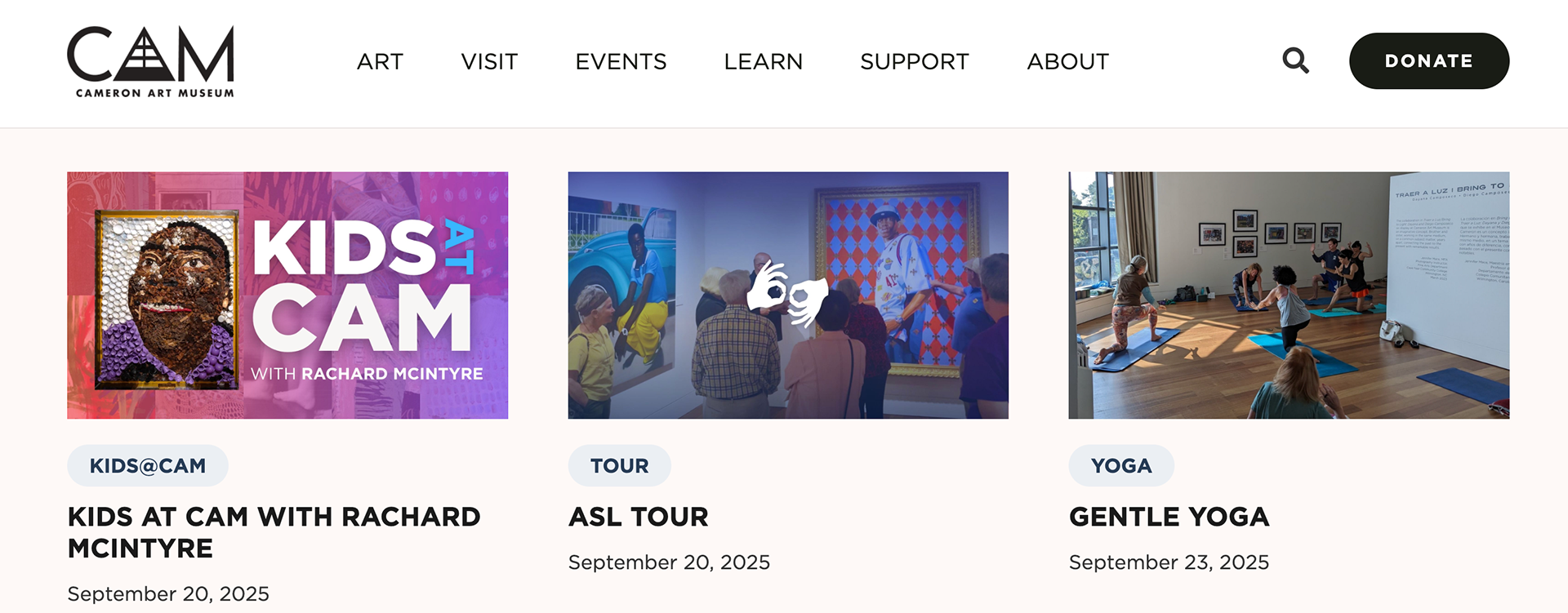
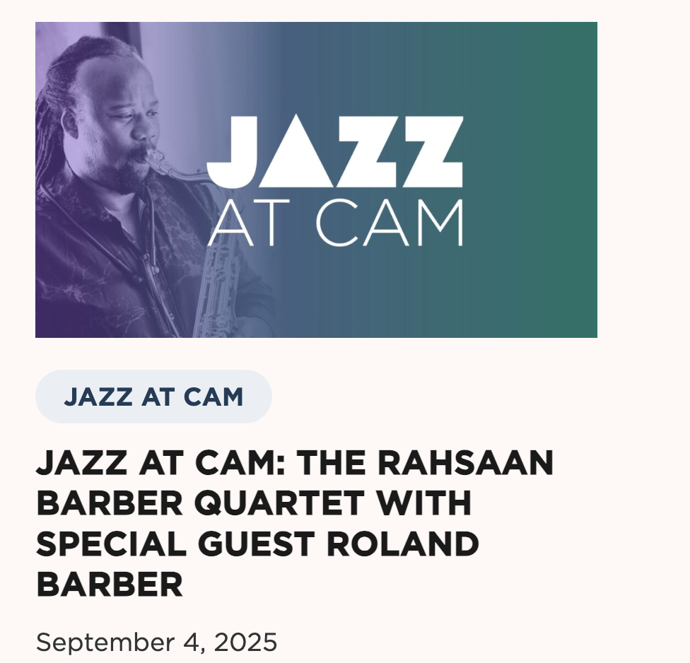
WEB EVENT GRAPHICS
In addition to creating weekly visitor screens, I also designed web graphics for the events tab on the Cameron Art Museum website. This process taught me how to adapt informational screen layouts into engaging, attention-grabbing thumbnails that worked effectively in a digital format.
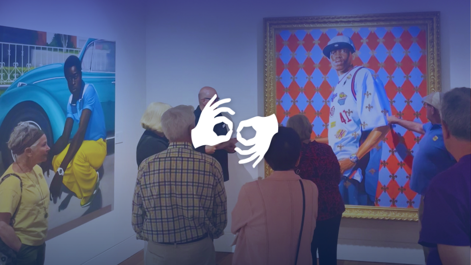
LIVE SITE SCREENSHOTS:
WELCOME SCREENS & PRESENTATIONS
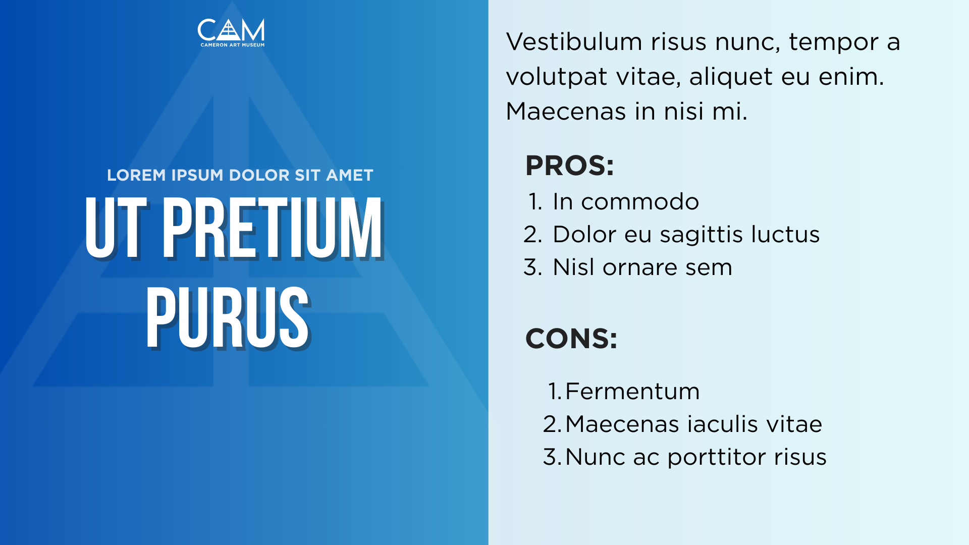
For the final part of my digital content work, I created welcome screens and presentation slides for a variety of events. These designs were made in Canva using company assets, with creative freedom ranging from minimal direction to more open-ended projects. This experience taught me how to maintain brand consistency across different presentation formats while exploring layout, hierarchy, and readability. Below are examples of welcome screens for Love Dance, New Hanover County Employee Day, and Creative Mornings, as well as slides created for internal presentations.
LOVE DANCE ANIMATED WELCOME SCREEN:
EVENT VIDEO:
MORE WELCOME SCREENS & PRESENTATIONS:
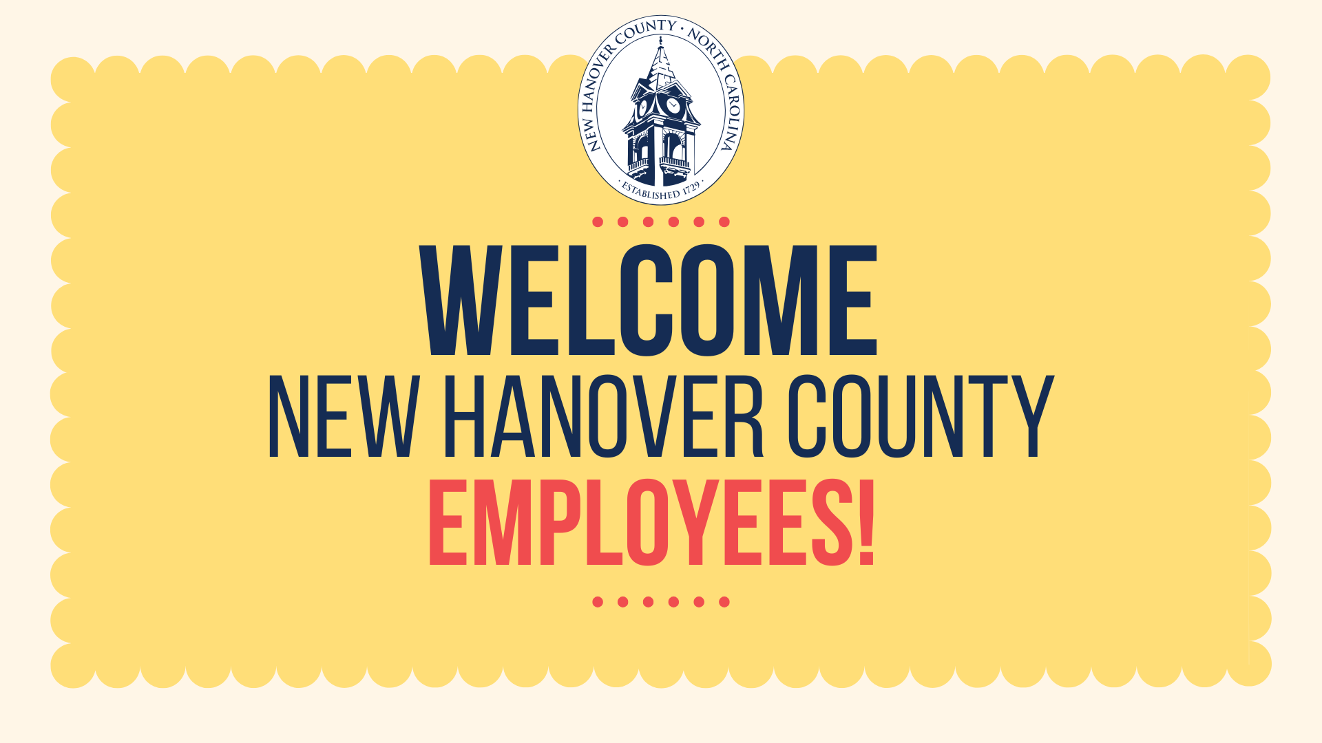
NHC Welcome Screen
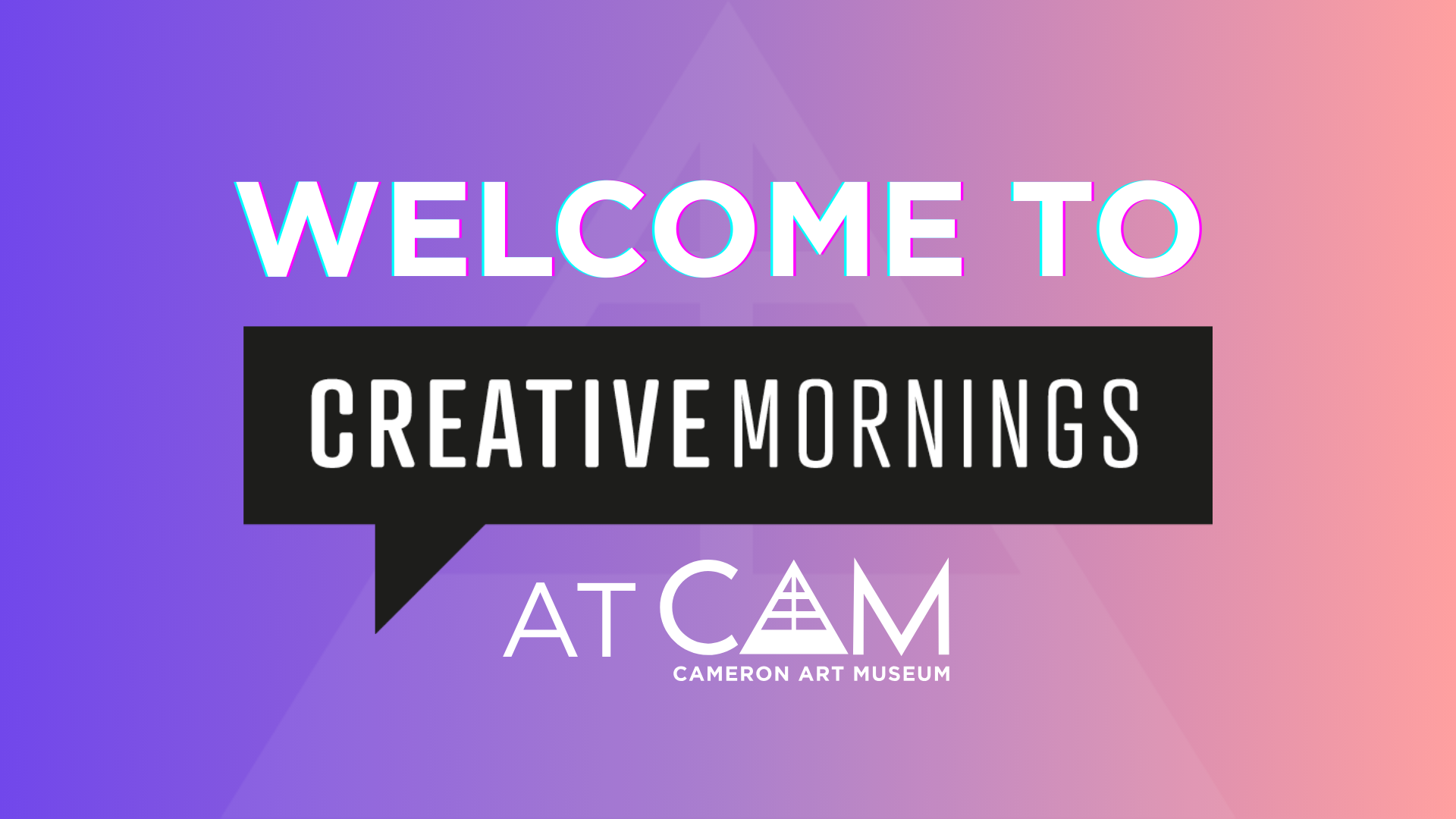
Creative Mornings Welcome Screen 1
Creative Mornings Welcome Screen 2
Internal Presentation 1
Internal Presentation 2